Forms for applications
Table of Contents
Quick start
Field components can be used directly as they are, for example Field.Email:
import '@dnb/eufemia/extensions/forms/style'import { Field } from '@dnb/eufemia/extensions/forms'render(<Field.Email />)
By building an entire form with components from Eufemia and Eufemia Forms, you save time and code:
import '@dnb/eufemia/extensions/forms/style'import { Card } from '@dnb/eufemia'import { Form, Field } from '@dnb/eufemia/extensions/forms'render(<Form.Handlerdata={existingData}onChange={...}onSubmit={...}><Card spacing="medium"><Field.Stringpath="/companyName"label="Bedriftens navn"required/><Field.OrganizationNumberpath="/companyOrganizationNumber"required/><Field.Selectionpath="/postalAddressSelect"label="Ønsket sted for tilsendt post"variant="radio"><Field.Option value="companyAddress" title="Samme som forretningsadresse" /><Field.Option value="other" title="Annet" /></Field.Selection></Card></Form.Handler>)
Philosophy
Eufemia Forms is:
- A framework for building features
- Flexibility by design
- Data-driven API
- Standardized data handling
- Loosely coupled components
Eufemia Forms is a set of building blocks for form functionality. Components are built on an API with standardized sets of props that make it easier to combine with surrounding data flow, and not least to create your own components that work well together with the ready-made components in Eufemia Forms.
An important point is that the components are data-driven. They are built on the premise of the source data, rather than being closely coupled to HTML elements that the internal implementation uses.
Features
Eufemia Forms consists of reusable components for data input, data display and surrounding layout for simplified user interface creation in React, built on top of base Eufemia components.
In summary:
- Ready to use data driven form components.
- All functionality in all components can be controlled and overridden via props.
- State management using the declarative JSON Pointer directive (i.e
path="/firstName"). - Simple validation (like
minLengthon text fields) as well as Ajv JSON schema validator support on both single fields and the whole data set. - Building blocks for creating custom field components.
- Static value components for displaying data with proper formatting.
Basic field usage
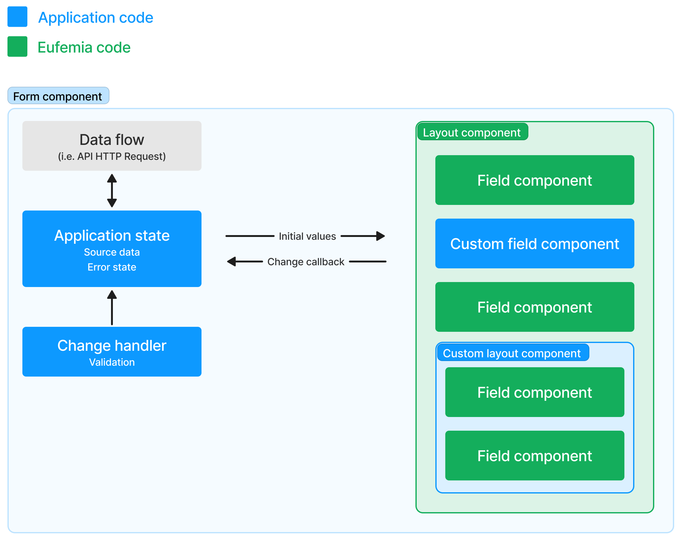
Components in Eufemia Forms are very flexible. They adapt to the set of props they receive, and you can therefore choose which parts of the functionality they consist of that you use, and what you yourself want to handle in the application code.
Here is an example that consists of a large degree of data handling in the application, even though the form itself still consists of both components from Eufemia and local special components (the blue boxes):

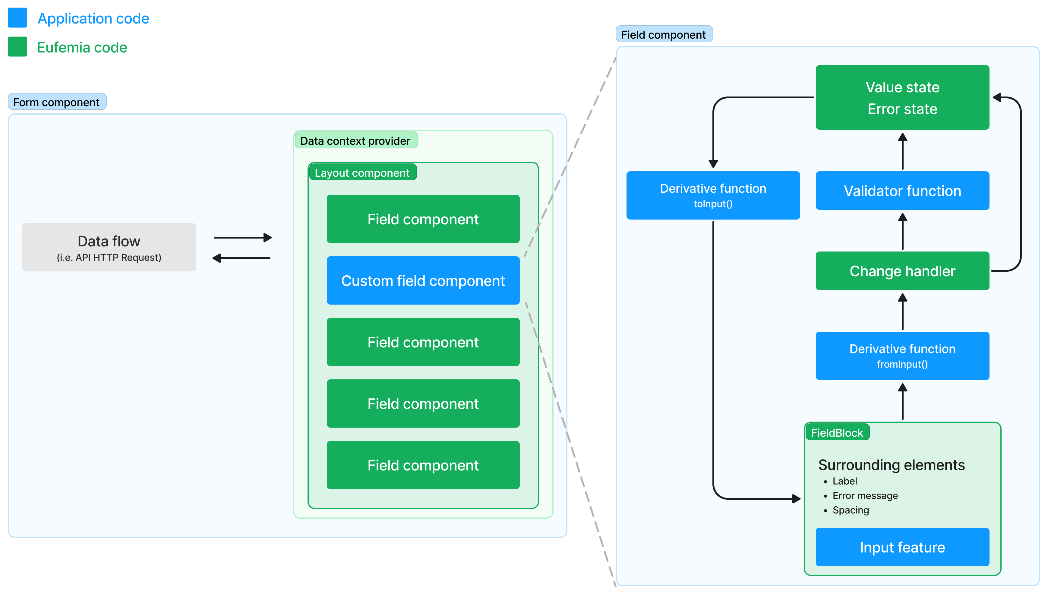
Complete state management and local custom fields
In this example, all state data, validation process and error handling are done by components from Eufemia Forms, while in a local field component created especially for this application, there is a combination of standardized field functionality taken from Eufemia Forms, and local special code to achieve the goal of maximum reuse without sacrificing flexibility:

Examples
Getting started
You need to import the styles once:
import '@dnb/eufemia/extensions/forms/style'
Field components
The data-driven base field components are named and structured according to the type of data they can display and produce based on the user's input and action in the interface.
On top of these, a number of feature fields have been built that have special functionality based on given types of data, such as bank account numbers, e-mails and social security numbers.
Layout
When building your application forms, preferably use the following layout components. They seamlessly places all the fields and components of Eufemia Forms correctly into place.
- Flex layout component for easy and consistent application forms.
- Card for the default card outline of forms.
Creating forms
To build an entire form, there are surrounding components such as Form.Handler and StepsLayout that make data flow and layout easier and save you a lot of extra code, without compromising flexibility.
Value components
Beside the interactive Field components, there are also the static Value components. Use these to show summaries or read-only parts of your application with benefits such as linking to source data and standardized formatting based on the type of data to be displayed.
Create your own components
Eufemia Forms consists of helper components and tools so you can declaratively create interactive form components that flawlessly integrates between existing data and your custom form components. This ensures a common look and feel, even when ready-made components are combined with your local custom components.
Read more about on how to create your own component.
Requirements
Some of the internal logic requires support for importing JSON files. Meta frameworks do often support this by default.